How do I find my colours season?
Have you ever read articles or articles about colour matching and been intrigued by it? Would you like to know what your colour season is, but you don’t know how? Until a decade ago, some people were aware of the importance of colour on the face, and it is mainly image consultants and colour specialist who take an interest in it and explain it to their clients. .
Today, however colour analysis has become a trend in our country and, as often happens, when a subject or discipline (as in this case) is rapidly gaining popularity, there is a proliferation of publications, so-called specialists and services offered. As in the United States and other countries around the world, there are also software and apps that promise to reveal the season of colours. In this jungle, how do you know who to turn to?
How to find your way around the colour analysis sector? How do you identify your colour season?
First of all, we would like to point out that software and automated applications currently on the market are unreliable in determining the season.
TIP # 1: AVOID DIY
The world of colour is a complex field where disciplines and sciences such as colorimetry, colour theory, optics, physics, neuroscience, psychology and art meet. The experience and expertise of a professional in this field are irreplaceable.
Thinking about self-analysis through an app or software or after reading an article or a single manual is a bit like thinking that you can make a medical diagnosis on your own by reading information online. Of course, if the medical diagnosis is wrong, the consequences can be very serious, whereas in the case of colour, if the colour analysis is wrong, you run the risk (only ?!) of upsetting your guard- dress. with the wrong colours and penalising it. But the principle is the same.
The first piece of advice, therefore, is: Avoid doing “do it yourself” and go to an experienced professional.
TIP # 2: USE AN EXPERIENCED PROFESSIONAL
Turning to a professional is always the best choice. But how do you recognise an expert from a poorly trained or improvised analyst? It is not an easy task to recognise the skills of a consultant in an area such as colour matching, which we as consumers may not know much about. There are some very good and well prepared consultants and others who really improvise and it is not always easy to tell them apart, but you can start from the following aspects:
Preparation and training: where did the analyst train? When? how long did the training last? Is your training recognised by an external body (by a certification body or the International Association of Image Consultants)? Or does it simply issue a certificate of attendance without effective verification of the skills acquired? If the analyst is self-taught, is he a benchmark for his many years of experience, number of clients and publications? When carrying out an analysis, does he give detailed and in-depth explanations of the reasons for his choice and is he didactic in his follow-up, or does he set himself up as a guru without explaining himself carefully?
TIP #3: UNDERSTAND WHAT METHOD YOU ARE USING AND WHY
Colour analysis is not universal, and there is no one method or approach – there are many. Some methods are approved and effective, with a solid foundation in colour theory, others are more imaginative. When you talk to an expert, you can ask them what method they use to perform their colour analysis and why they think this method is better than the others.
If he has learned only one method, he will not be able to answer coherently and will give incomplete answers (for example “because he is famous”, “because it is the method of Titius or of Caius “). If, on the other hand, he is a well-documented gunsmith, he will be able to explain to you why he chose a particular method among the many existing methods. And it will also allow you to understand if the explanations and the illustrated method convince you and seem trustworthy.
TIP # 4: GO FOR CUSTOMISATION
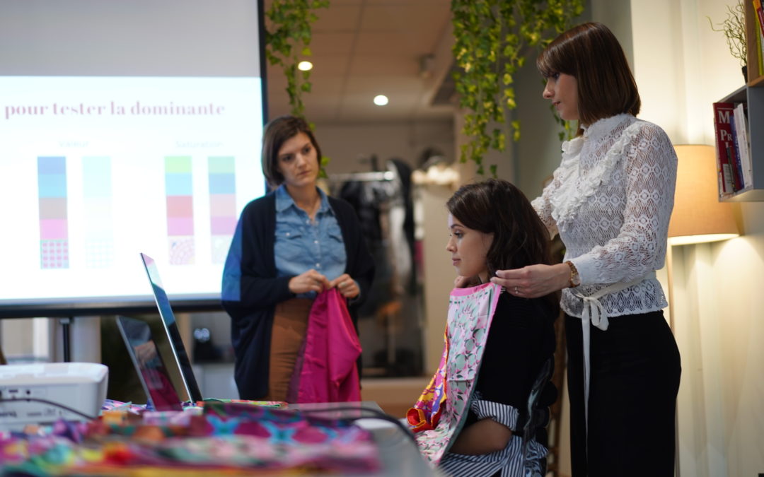
Colour analysis requires the ability to identify facial colours and their characteristics in order to reproduce them harmoniously in the colours to be used. To do this, you need – obviously knowing what the characteristics of a colour are and how to distinguish them, their components or their dimensions (like hue and temperature, saturation, brightness, value, etc.) – to know identify the level of each characteristic colour for each colour element of the face (iris, skin tone, eyebrows, hair), for example, being able to distinguish on a scale of 1 to 10 the value (or lightness) of the skin, in a temperature scale, skin tone, etc. Identify which colours m correspond to the values and levels of colour characteristics (this is done in most cases by means of a comparative fabric test). Based on the results of the previous point, establish a set of colours that reproduce the same characteristics as the personalised item (this step is often made up of the so-called seasonal colour palette).
It is obvious that if we consider at least 3 characteristics of colour (value, temperature and saturation, but we could name others), the 4 main elements of the face (eyes, skin, eyebrows and hair) and for each characteristic one establishes that one could have at least 3 levels (for example cold, neutral and hot for the temperature), but it would be better to be more detailed, it is obvious that the possible combinations are in reality much, much more than the 4, 12 or 26 colour stations of the different best known methods. Within a colour station there will certainly be a number of people who may differ from each other in one or more characteristics and not all of them will be 100% enhanced by the standard colour scheme.
So if you want to make sure you get a list of colours that really stand out, it is best to hire a professional to perform a personalised, individualised colour analysis (if you want to know how our consultants specialise in custom analysis, don’t hesitate to let us know contact!). in this case, all the colours in your palette will be correct and the consultant will also explain how to match them and how to choose the patterns and prints that suit you!
TIP # 5: REMEMBER WHAT COLORS COMMUNICATE AND WHAT THEY MEAN TO US
Dressing in palettes and just following harmony in your clothing choices is not very helpful. Each colour has a psychic, emotional, symbolic and communicative impact on those who look at it.
In short, a colour “speaks” and “communicates” both to those who see us and to ourselves who wear it.
Therefore, it is important to be assisted by a professional who is able to identify the colours that strengthen our personal identity, but who is also able to tell you how to choose the colours that express our identity and help us achieve our goals. Communication. Choosing the colour is not only a question of logic and rationality, choosing the colour is also a question of emotion and feeling.